With Us In Mind
Case Study
As the sole UX Designer and Researcher in this project, I researched users and competitors, created a low fidelity prototype, ran a usability test and got peer feedback, and designed a high fidelity prototype with the polished designs. You can find out the details and my process in the sections below.
Overview
Introduction
The User
Initial Concepts
Polished Designs
- My Role
- My Goal
- Target Audience
- The Problem
The User
- Foundational Research
- Persona
Initial Concepts
- Competitive Audit
- Brainstorming
- Digital Wireframes
- Low Fidelity Prototype
- User Testing Results
- Iterations
Polished Designs
- Mockups
- High Fidelity Prototype
- Responsive Website
- Conclusion
Table of Contents
My Role
Solo UX Designer & Researcher
Introduction
My Goal
Create a resource for gamers with disabilities to easily browse the settings of games so they can make more informed decisions about which ones they spend their time and money on. I designed a dedicated app first and a complementary responsive website second. Hooray progressive enhancement!
Target Audience
Disabled gamers & accessibility advocates.
The Problem
Disabled gamers do not have a quick and easy way to know if they are able to play a game comfortably without buying it and playing it first. This can lead to frustration about the play experience as well as wasted money.
I focused on researching the experiences of people with a single disability to start with to keep the scope manageable. By interviewing a few colorblind people, I discovered:
1. Colorblind gamers are used to not having a reliable way to check games beforehand.
2. They're also used to not having any accessibility options for them.
3. Even if a game does have colorblind options, they are not always effective and can make the game look worse.
1. Colorblind gamers are used to not having a reliable way to check games beforehand.
2. They're also used to not having any accessibility options for them.
3. Even if a game does have colorblind options, they are not always effective and can make the game look worse.
Meet Daveed! Daveed is a father and gamer who needs to check the accessibility of games before he buys them because he doesn't want to waste money on games he can't play and to have more money to spend on his kids.
Persona
The User
Foundational Research
Meet Cheryl! Cheryl is a busy graphic designer who needs a quick and easy way to order unique flowers for her family because she wants shopping to be as enjoyable as giving.
Persona
Daveed is a doting father who loves to play video games with his daughters. It is tough for him to explain to his small girls why he can’t play certain games with them. He gets annoyed when he spends money on a new game only to find it isn’t accessible, and some companies won’t refund the purchase. It has made him shy away from certain game genres. He’s hesitant when looking for new games rather than excited which makes him kind of sad.
Daveed
1. Enjoy games with his family.
2. Save money by checking a game’s options before buying.
3. Avoid disappointment from inability to play.
2. Save money by checking a game’s options before buying.
3. Avoid disappointment from inability to play.
Goals
1. Some games are unplayable.
2. Options are limited and can make the game more difficult to look at.
3. Small chance of refunds for unplayable games.
2. Options are limited and can make the game more difficult to look at.
3. Small chance of refunds for unplayable games.
Frustrations
Daveed is most likely to use his phone to check for game details while he is in the store or on a tablet while looking for new games for his daughters at home.
Platform
Initial Design Concepts
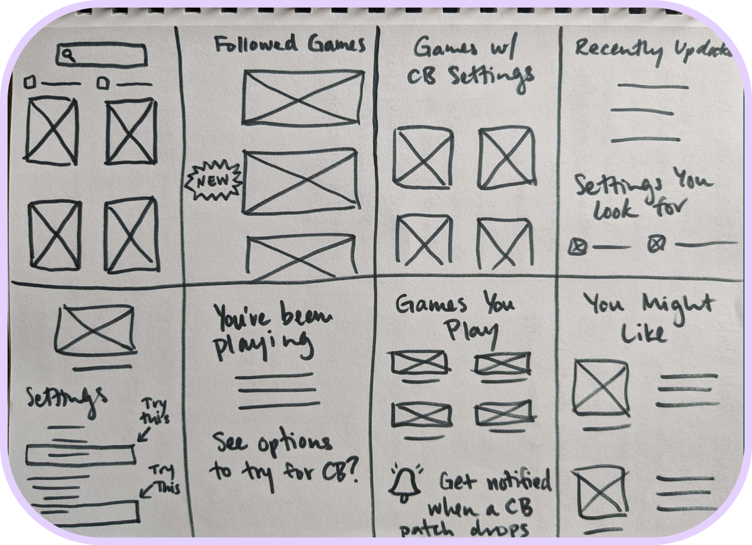
I did a Crazy Eights exercise for the project, focusing on different ways to present settings to players.
Brainstorming
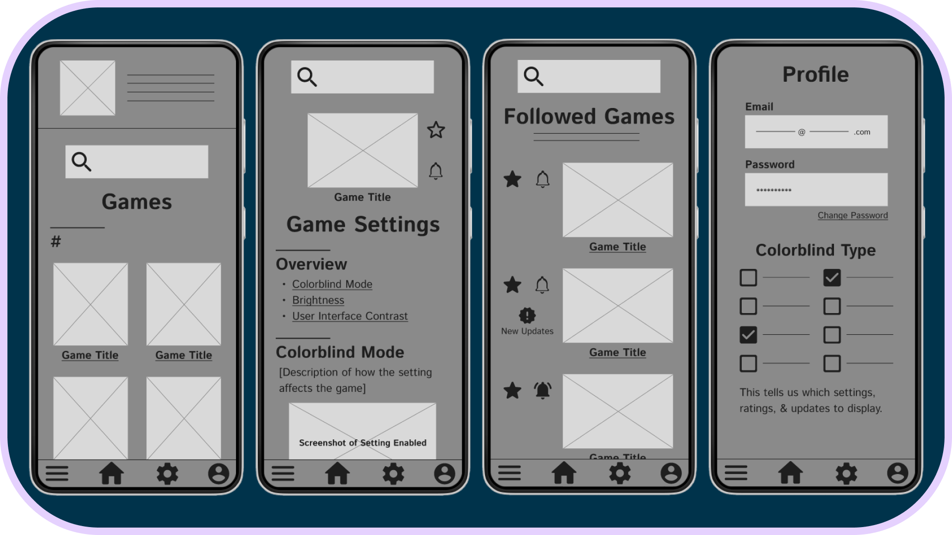
Since video games are largely a visual medium, I wanted the database to feature large thumbnails for each game to encourage browsing. The prominent search bar helps players find the game they’re looking for in seconds. App settings for accessibility are immediately available from any page.
Digital Wireframes
Low Fidelity Prototype
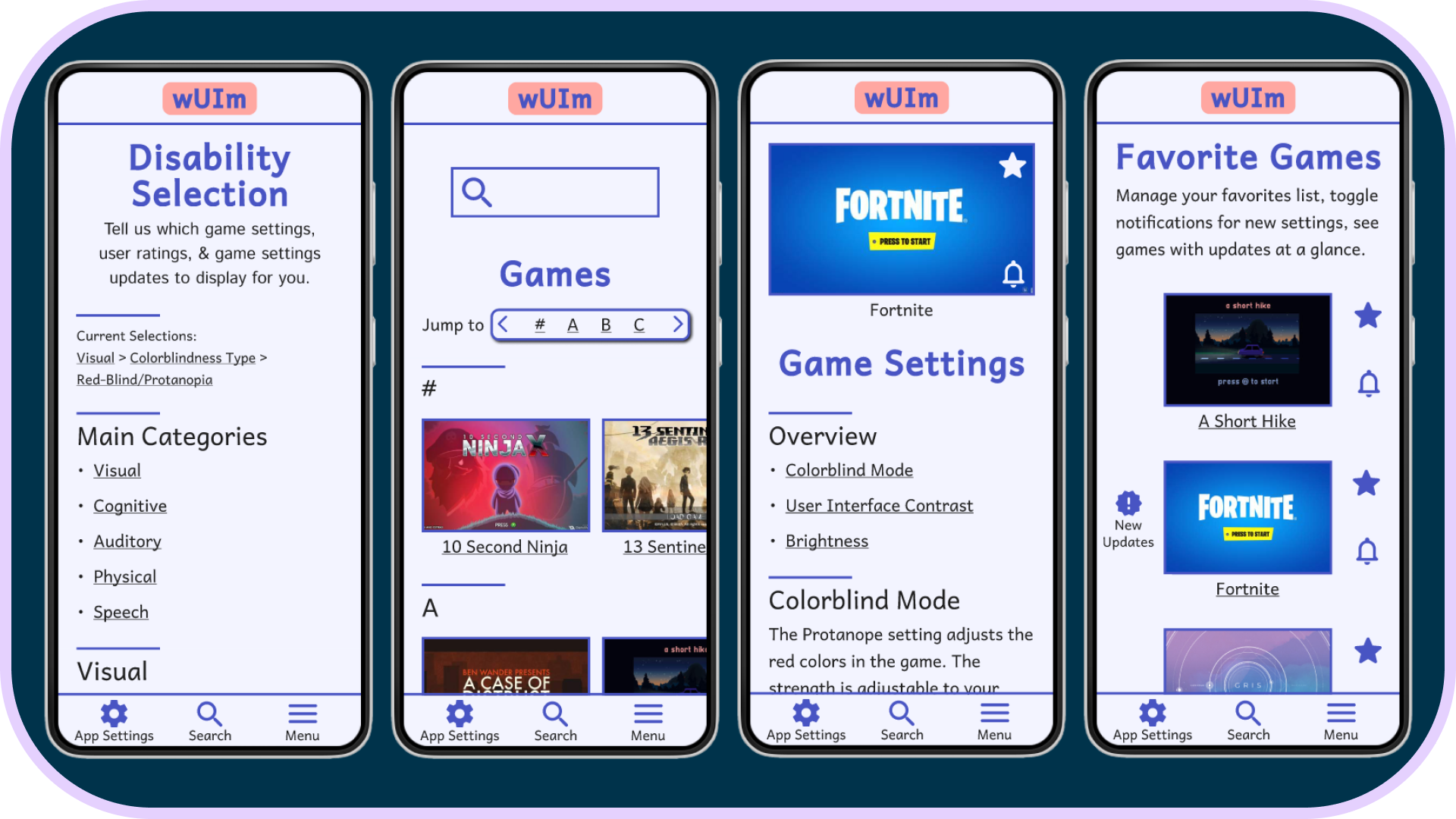
I connected each screen for the main user flow, leading from sign in to the database of games on the home page, and from there to the game settings page where the heart of the resource is.
User Testing Results
I planned and conducted an unmoderated usability study. People struggled to feel confident navigating the menus and understanding what exactly each icon entailed and what certain functions applied to (the current screen versus the whole site), so I needed to design a more intuitive menu system and give better guidance on unclear elements.
There are not a lot of accessibility resources out there! I compared two accessibility-focused sites and one database that some people use as an accessibility resource even though that's not what it was built for. All the more features for me to fill in the gaps with!
Competitive Audit

Iterations
With the usability study in mind, I kept the design clean while adding tooltips and reorganizing the menus. I added a pop-up on hover to explain the notification bell, and simplified into a single menu system. I changed "Followed Games" to the more familiar "Favorite Games". I also utilized peer feedback to iterate and refine the design including bringing the accessibility aspect of the concept more into focus.
- Semi-direct competitor whose target audience is gamers with mobility disabilities.
- Unique Value Proposition: One-stop shop for gamers with mobility issues to see which new releases are playable for them and what tech might help them play.
- This site benefits from a smaller scope and accessibility settings displayed on each page. However, they only cover a small number of games, the reviews are an inconsistent mix of videos and text, and their tags and sorting are quite jumbled.
Game Access
- Indirect competitor whose target audience is UX & UI designers.
- Unique Value Proposition: Thousands of examples of design choices to reference and analyze.
- This site has a great layout with lots of filters and categories, and the search pulls terms from within screenshots. However, which screens are included varies, and it is does not cater to accessibility.
Game UI Database
- Direct competitor whose target audience is gamers with disabilities.
- Unique Value Proposition: Centralized site for accessibility-focused reviews and menu options.
- The site is visually pleasing, and they cover a lot of avenues. However they only cover a limited number of games, there is a lack of consistency in the structure of reviews and which disabilities are covered. Navigation could be a little bit better.
Can I Play That?
Polished Designs
High Fidelity Prototype
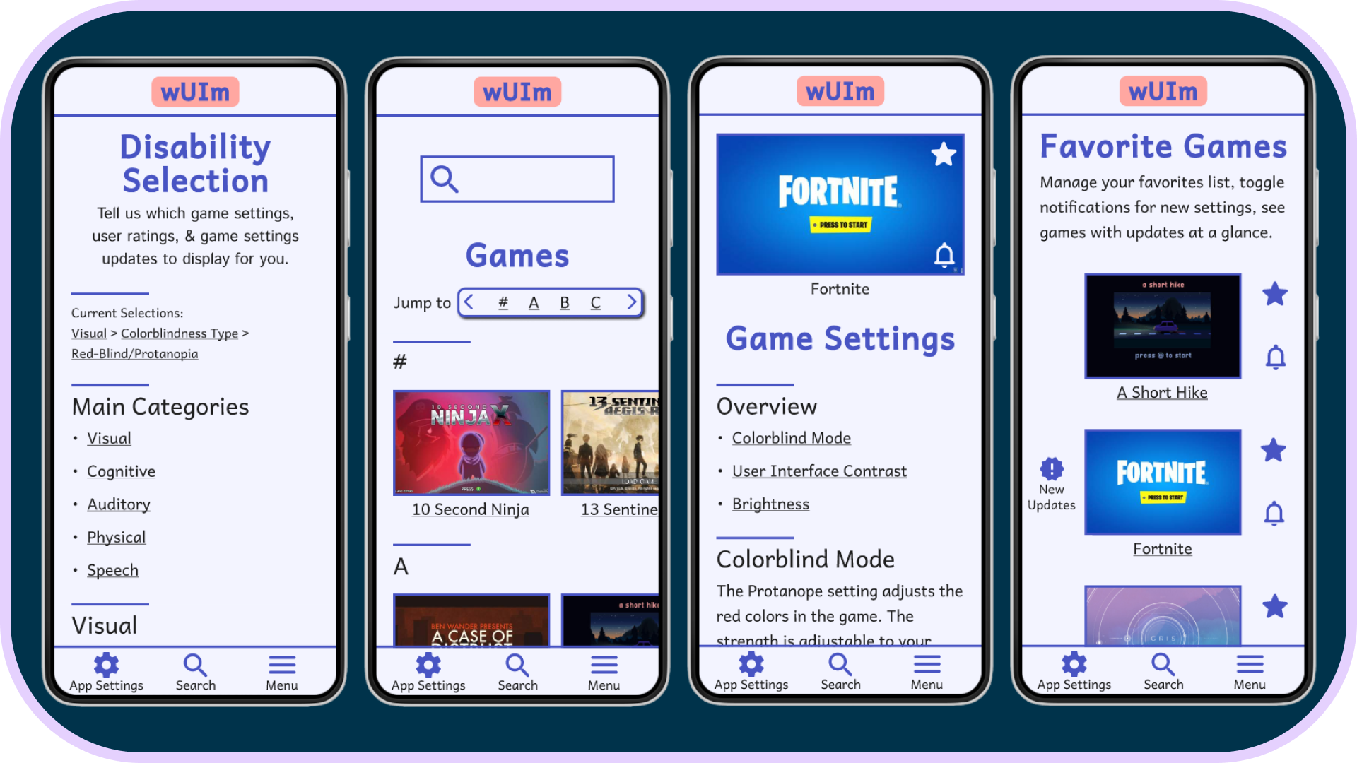
The flow is the same as the low fidelity version, but with different menu connections and with disability selection brought to the start of the flow rather than tucked away in the Profile.
Conclusion
“The fact that users get to crowdsource how useful the settings actually are in practice is great.” - Travis
This resource will help disabled people determine which games serve them. It is scalable to ultimately include many more disabilities and save all types of players time and money.
I learned that I shouldn’t let concerns over dynamic elements limit the rest of the design layout. I had similar feedback in a previous project about icons taking up too much space, and it slipped my mind since I was so focused on how to deal with circumstantial elements.
The next steps I would take are to conduct another usability study on the high fidelity prototype to ensure that the changes properly addressed all the issues and do a study with only colorblind people to ensure the the color palette does not add any pain points.
This resource will help disabled people determine which games serve them. It is scalable to ultimately include many more disabilities and save all types of players time and money.
I learned that I shouldn’t let concerns over dynamic elements limit the rest of the design layout. I had similar feedback in a previous project about icons taking up too much space, and it slipped my mind since I was so focused on how to deal with circumstantial elements.
The next steps I would take are to conduct another usability study on the high fidelity prototype to ensure that the changes properly addressed all the issues and do a study with only colorblind people to ensure the the color palette does not add any pain points.
Responsive Website
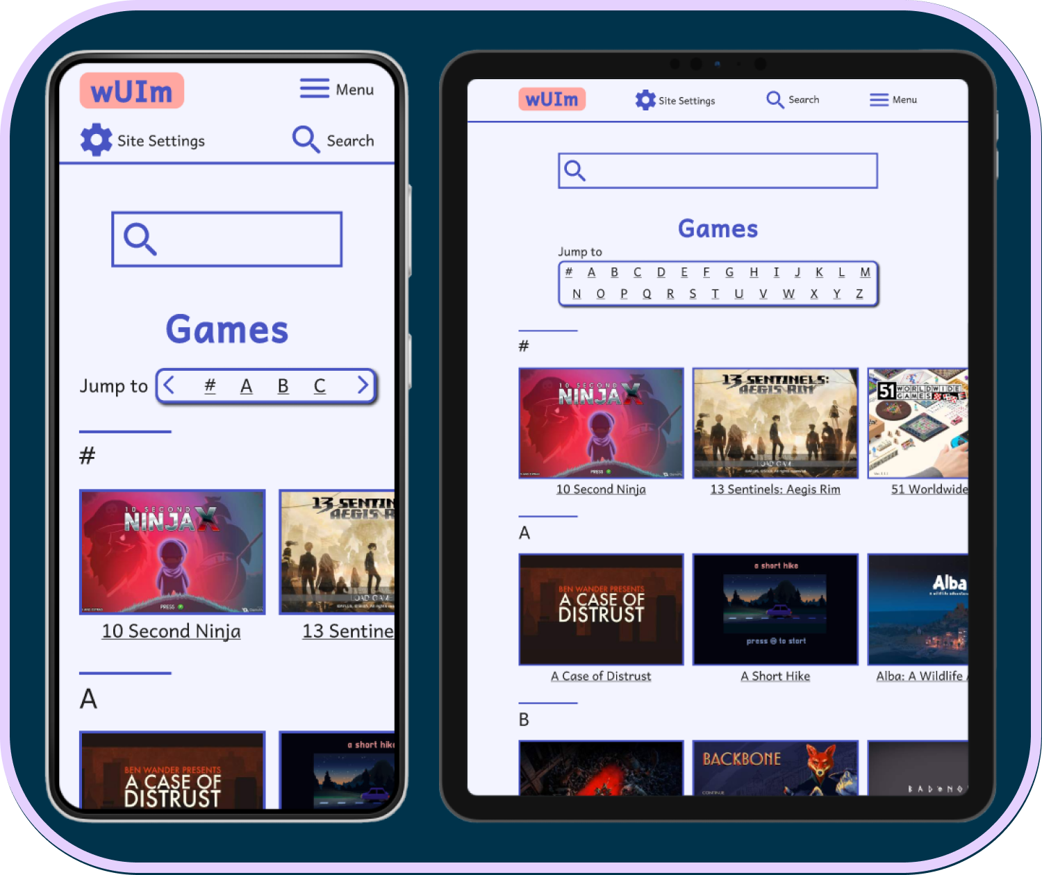
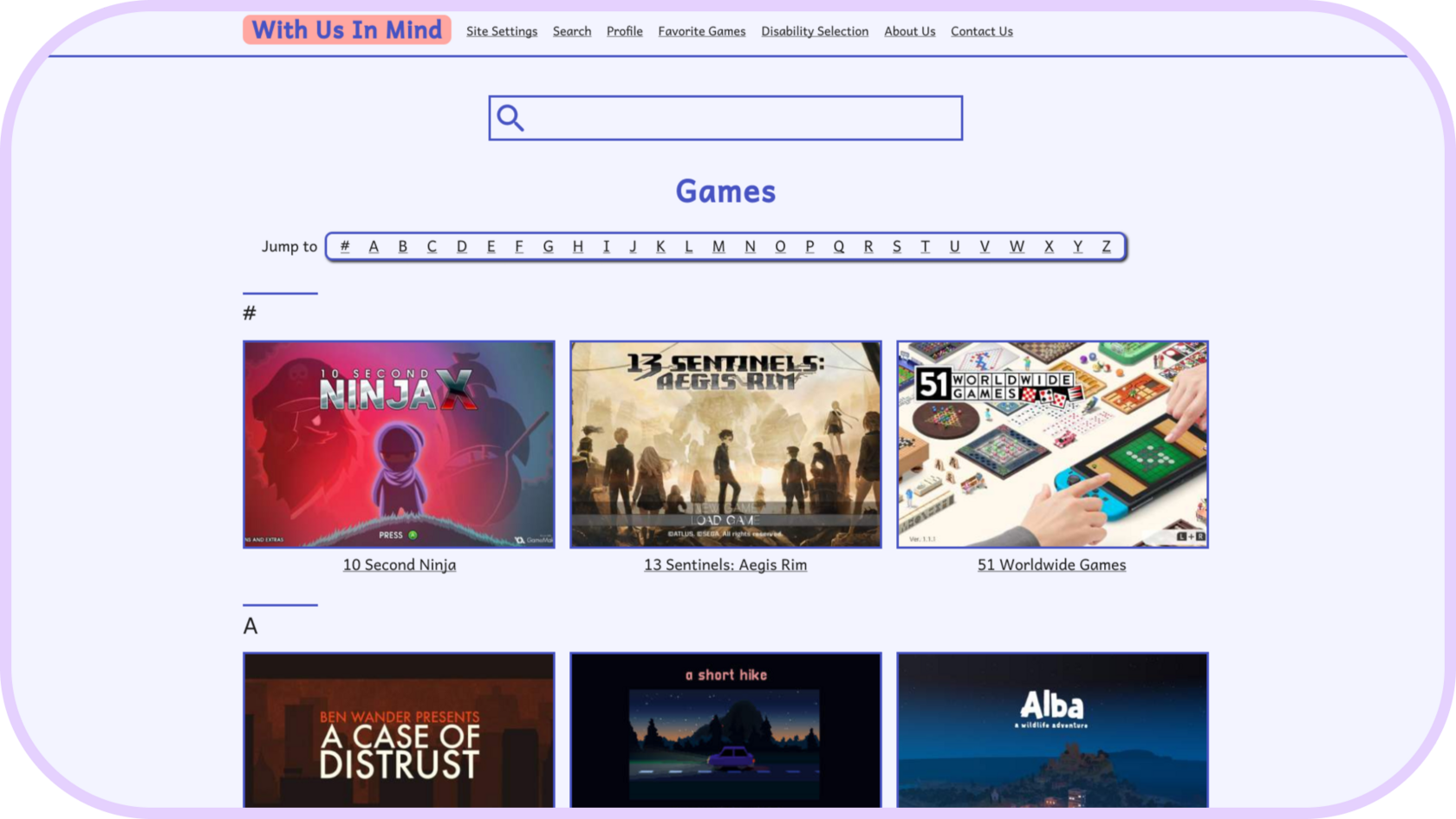
Very similar to the mobile app design with considerations for different contexts and screen sizes. For example, I kept the nav bar at the top on the mobile website to make it consistent with the other sizes.
I used a limited color palette and large text, making sure to meet AA accessibility standards for contrast.
Mockups
Curiosity about life in all its aspects, I think, is still the secret of great creative people.
Introduction
Introduction
Introduction
Introduction
