Netherguild
Overview
As a UX Design Consultant, I researched player pain points, ideated on some initial design concepts and got feedback, and presented high fidelity mockups showcasing the polished designs. You can find out the details and my process in the sections below.
Case Study
Original Title Screen
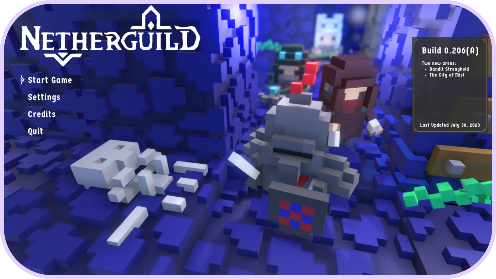
New Title Screen
Original "In Character" Popup
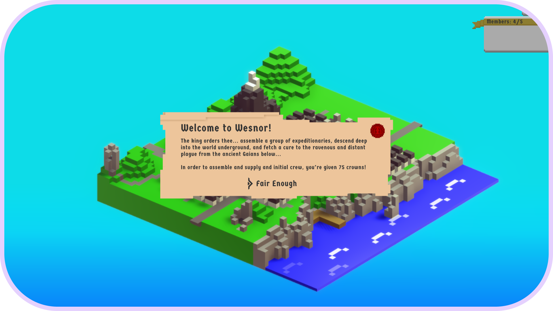
New "In Character" Popup
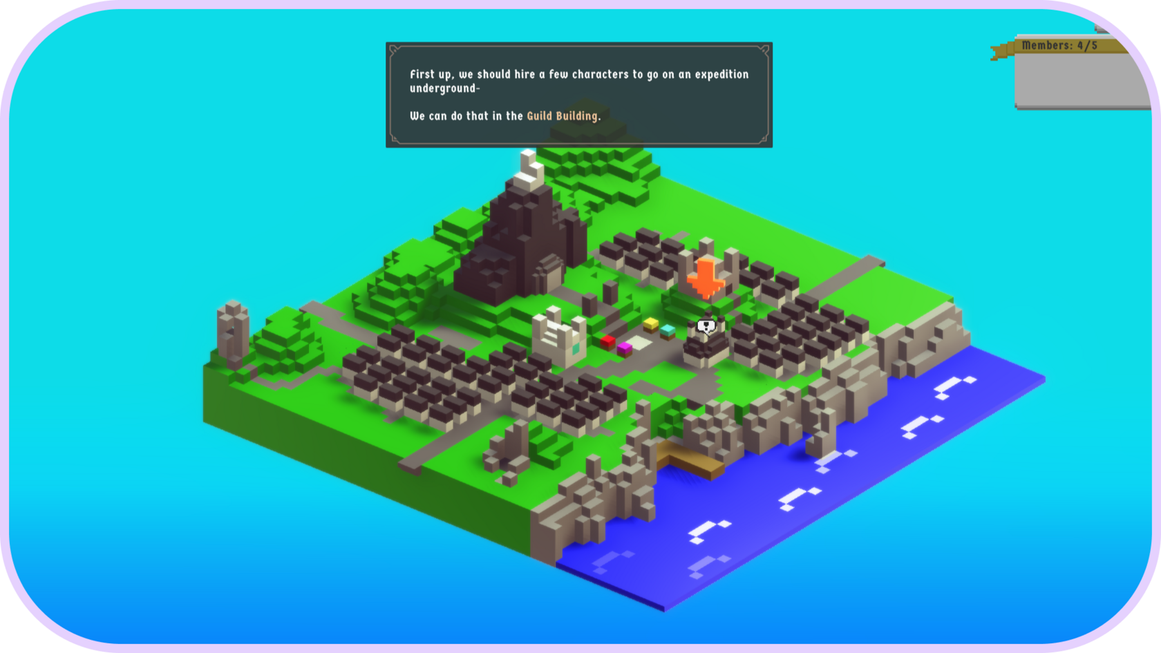
Original Tutorial Popup
New Tutorial Popup
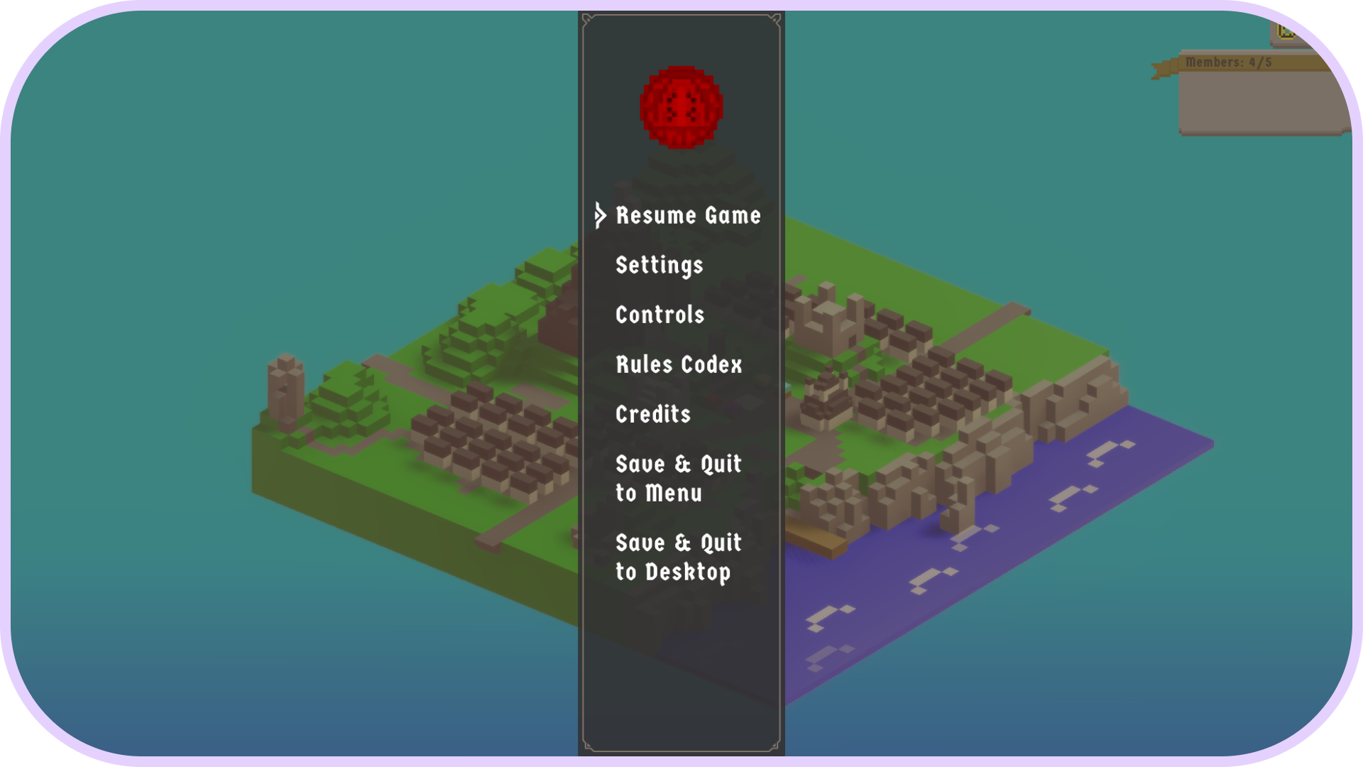
Original Escape Menu
New Escape Menu
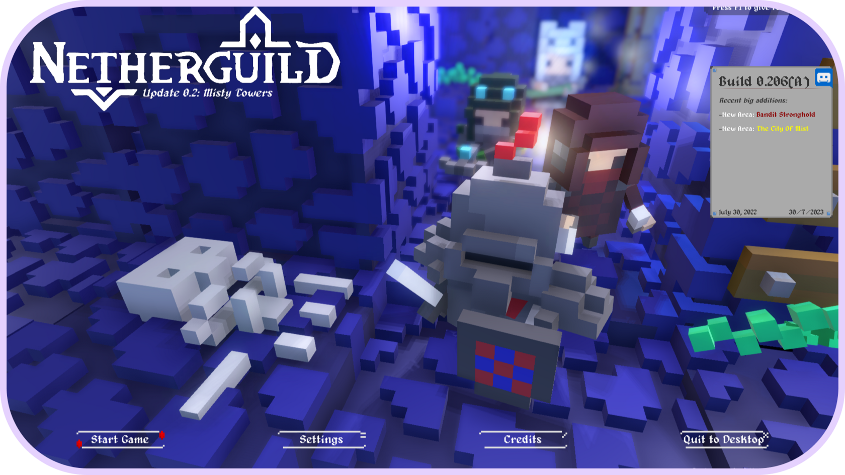
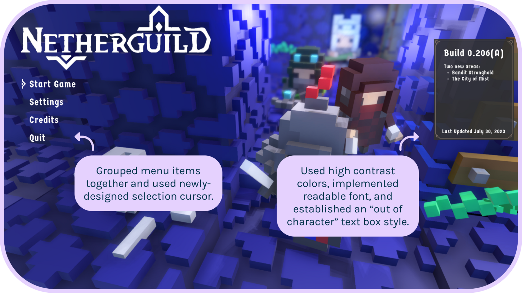
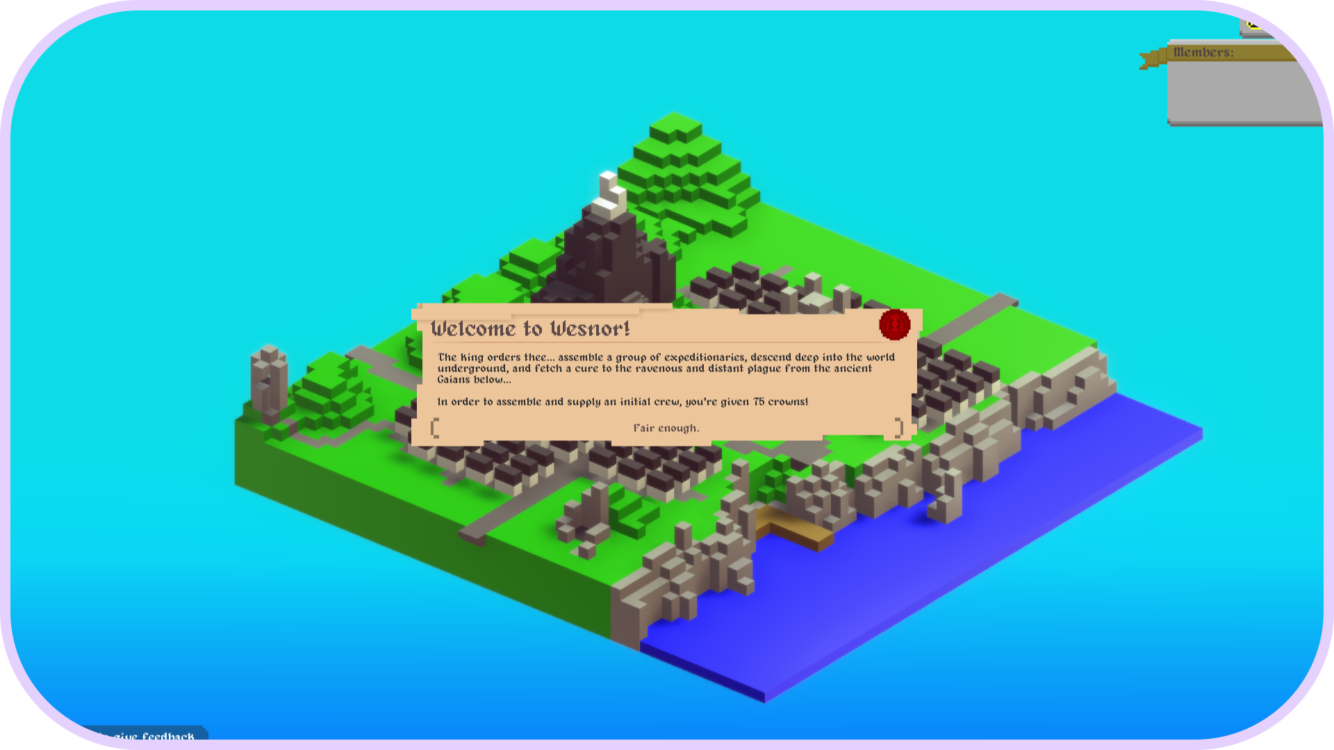
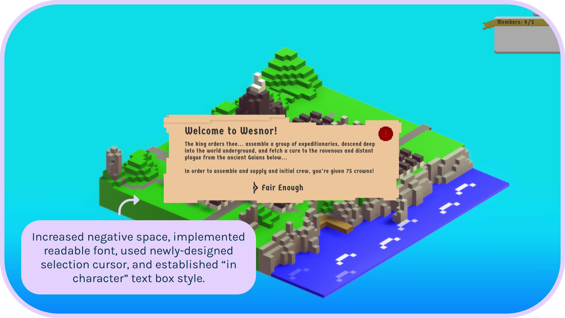
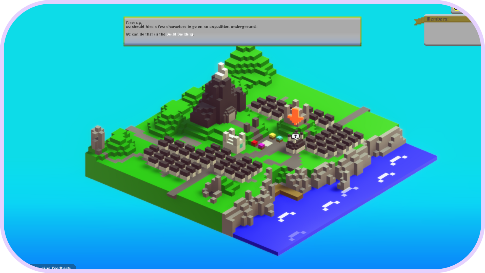
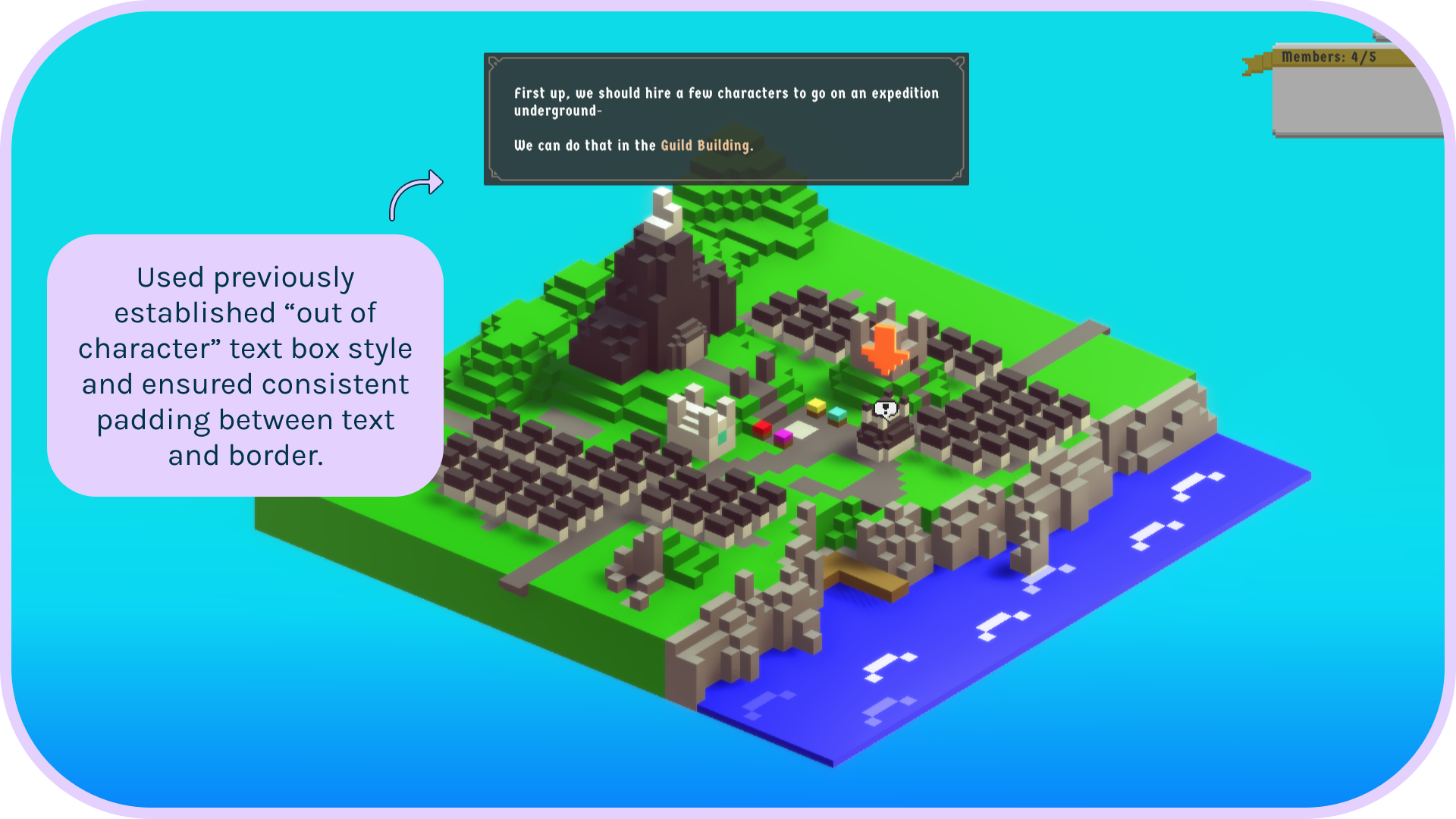

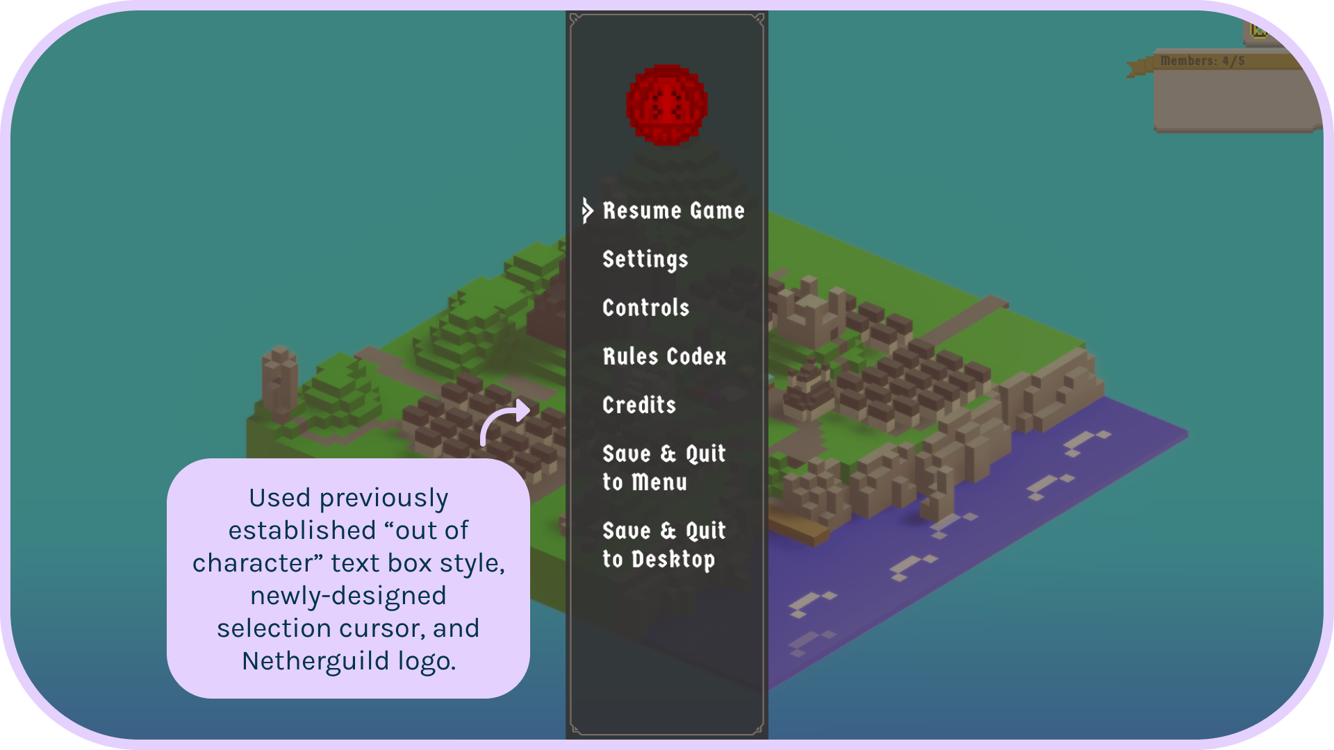
Table of Contents
My Role
UX Design Consultant
Introduction
My Goal
Help David, the solo developer of Netherguild, improve the current designs and create a design system to increase consistency throughout the game.
Target Audience
New and veteran Netherguild players.
The Problem
Netherguild has a fantastic art style and fun, dynamic gameplay, but players feel the UI doesn't match the quality of the rest of the game and have trouble reading the text.
Research

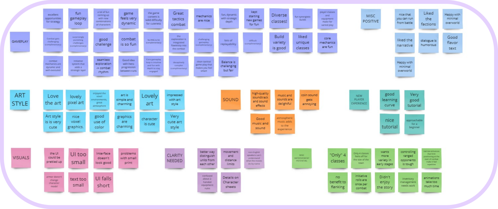
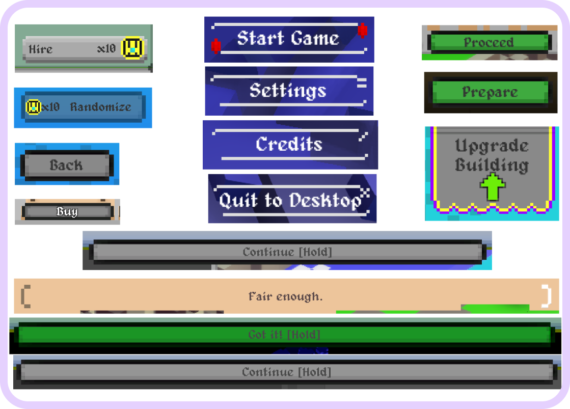
I combed through the Steam reviews as well as the feedback channel in the Discord, watched some playthroughs of the game, and played it myself.
I synthesized the data into an affinity diagram so I could pin point the most important improvements to focus on.
I synthesized the data into an affinity diagram so I could pin point the most important improvements to focus on.
Affinity Diagram
Discoveries
I discovered that:
1. Players feel the UI isn't as attractive as the rest of the game.
2. Players found the text to be too small and difficult to read.
3. There is a lot of variation in visual style and placement of buttons and text boxes which increases cognitive load unnecessarily.
1. Players feel the UI isn't as attractive as the rest of the game.
2. Players found the text to be too small and difficult to read.
3. There is a lot of variation in visual style and placement of buttons and text boxes which increases cognitive load unnecessarily.
Initial Design Concepts
Since I hadn't seen the development choices from the beginning of the game's life cycle, I wanted to learn more about the current design choices to see what had significance to the game lore so I would have a better idea of which existing designs to pull from in my iterations.
I learned that the red seal and the Netherguild text logo are important, and we love them. The red gems and corner swirls were early embellishments that don't have larger importance to the game. I also confirmed that the "in character" text boxes for events or missives were intentionally different from the "out of character" menus and tutorials.
I learned that the red seal and the Netherguild text logo are important, and we love them. The red gems and corner swirls were early embellishments that don't have larger importance to the game. I also confirmed that the "in character" text boxes for events or missives were intentionally different from the "out of character" menus and tutorials.
Developer Interview
Feedback
David reviewed the designs and selected the one he liked best which was the first idea in the above sketch. He expressed concerns that players might not know to interact with it since it doesn't look like a button. I suggested that we run a usability test to make sure players find the new hover state/ selection indicator intuitive and that it doesn't add any confusion. I also suggested that a gentle animation might help to draw attention to it as well as complementing the other animations already in the game. We're looking forward to testing soon!
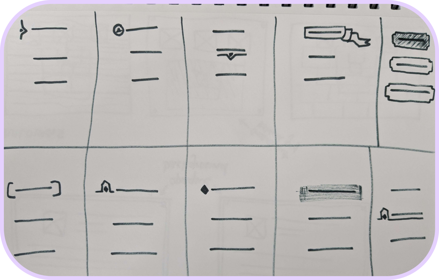
I did a Crazy Eights exercise, focusing on what buttons or clickable text might look like. I did the same for menu and tutorial boxes.
It was important to me to pull from the designs that were already present in the game since the players loved the art style so much.
It was important to me to pull from the designs that were already present in the game since the players loved the art style so much.
Brainstorming
Polished Designs
Conclusion
"Thank you for the great design! Looking forward to seeing what else you come up with" - David
David and I are both excited to continue working on improvements and choosing a design that is still in his voxel and pixel art style but with added polish, consistency, and accessibility.
It was a really fun challenge to work with an existing product and try to fit new ideas into the current framework! I enjoyed being able to discuss iterations with someone intimately familiar with the project's details.
Our next steps are to run a usability test for the new typography and selection indicator. Then I'll iterate on the pop up boxes for the rest of the "in character" elements like the inventory and quest selection. After that, I'm looking forward to theory crafting how to best indicate certain combat and movement elements to make them more clear.
David and I are both excited to continue working on improvements and choosing a design that is still in his voxel and pixel art style but with added polish, consistency, and accessibility.
It was a really fun challenge to work with an existing product and try to fit new ideas into the current framework! I enjoyed being able to discuss iterations with someone intimately familiar with the project's details.
Our next steps are to run a usability test for the new typography and selection indicator. Then I'll iterate on the pop up boxes for the rest of the "in character" elements like the inventory and quest selection. After that, I'm looking forward to theory crafting how to best indicate certain combat and movement elements to make them more clear.
Mockups
I took screenshots of the game and added the designs and typography David and I discussed and mocked them up in Figma to show what the changes would look like once they were implemented in the game.
New Title Screen
New "In Character" Popup
New Tutorial Popup
New Escape Menu
Typography
David and I agreed that the pixelated typeface probably contributed to the difficulty players had with readability, so I selected a new typeface that kept the "medieval" feel of the original and increased the size and spacing of the text.
Curiosity about life in all its aspects, I think, is still the secret of great creative people.
Introduction
Introduction
Introduction
Introduction
