High Scores & More
Case Study
As the sole UX Designer and Researcher in this project, I conducted user research, created a low fidelity prototype, ran a usability test and got peer feedback, and designed a high fidelity prototype with the polished designs. You can find out the details and my process in the sections below.
Introduction
The User
Initial Concepts
Polished Designs
- My Role
- My Goal
- Target Audience
- The Problem
The User
- Foundational Research
- Persona
- User Journey
Initial Concepts
- Paper Wireframes
- Digital Wireframes
- Low Fidelity Prototype
- User Testing Results
- Iterations
Polished Designs
- Mockups
- High Fidelity Prototype
- Conclusion
Overview
Table of Contents
My Role
Solo UX Designer & Researcher
Introduction
My Goal
Create a community-focused app to quickly and easily record scores and compare/ compete with friends.
Target Audience
Arcade game fans.
The Problem
Keeping score on paper is laborious and not interactive. Sharing and comparing isn't very easy either.
Meet Jonah! Jonah is a gamer with busy friends who needs an easy way to share and compare their scores because they can’t play with their friends in person.
Persona
The User
By interviewing a few people, I discovered:
1. If they can’t see their scores without scrolling through other entries, they will give up, so the design has to place a player’s score front and center.
2. Individual records aren’t easily shared with friends, so the design should make it easy to compare scores.
3. Flipping between records or needing to create their own graph/spreadsheet isn’t practical, so the design should make sure to have an easily available history.
1. If they can’t see their scores without scrolling through other entries, they will give up, so the design has to place a player’s score front and center.
2. Individual records aren’t easily shared with friends, so the design should make it easy to compare scores.
3. Flipping between records or needing to create their own graph/spreadsheet isn’t practical, so the design should make sure to have an easily available history.
Foundational Research
I dug into the minutia of Jonah’s journey at the arcade without the app to uncover aspects I might not have thought of beforehand and see how I might try to solve their issues when I designed the app's features.
User Journey
Meet Cheryl! Cheryl is a busy graphic designer who needs a quick and easy way to order unique flowers for her family because she wants shopping to be as enjoyable as giving.
Persona
Jonah works as a data analyst during the day and spends their evenings watching TV with their wife and cats. They love gaming with friends, but their schedules don’t always match up. That makes it difficult to play together, so they trade high scores as a fun way to stay in touch. Loser buys the pizza. They get annoyed when it takes too long to find their or their friends' scores. They enjoy when their love of statistics and gaming overlap.
Jonah
1. Find a way to keep their social life active despite scheduling difficulties.
2. See interesting statistics about their performance.
3. Have a record of their friendly competitions at their fingertips.
2. See interesting statistics about their performance.
3. Have a record of their friendly competitions at their fingertips.
Goals
1. “If I have to scroll through a million pages to find my score, I won’t bother.”
2. “I can’t compare all my friends’ scores side by side.”
3. “High scores can be fun short-term, but they lose meaning without other stats.”
2. “I can’t compare all my friends’ scores side by side.”
3. “High scores can be fun short-term, but they lose meaning without other stats.”
Frustrations
Jonah would use the dedicated app on their phone while at the arcade to record their scores.
Platform
Tasks: Plan which cabinets to play, wait in line, purchase tokens.
Feeling: Excited to take part in their hobby, curious to see if they're still on the leaderboard, nervous about not being able to hear the cashier.
Feeling: Excited to take part in their hobby, curious to see if they're still on the leaderboard, nervous about not being able to hear the cashier.
Step 1 - Visit the arcade & buy tokens
Tasks: Wait for their favorite cabinet to be available, play the game, write down score & rank, take a photo of the score screen & leaderboard.
Feeling: Proud to get a good score, anxious they're taking too much time to write, frustrated that the glare makes it hard to see the screen in photos, disappointed there are no additional statistics to enjoy.
Feeling: Proud to get a good score, anxious they're taking too much time to write, frustrated that the glare makes it hard to see the screen in photos, disappointed there are no additional statistics to enjoy.
Step 2 - Play games & record high scores
Tasks: Connect to wi-fi, send photos to friends, compare scores.
Feeling: Excited to share with friends, annoyed at bad wi-fi connection, irritated at having to flip through photos & text history to compare previous scores.
Feeling: Excited to share with friends, annoyed at bad wi-fi connection, irritated at having to flip through photos & text history to compare previous scores.
Step 3 - Send scores to friends
Initial Design Concepts
Paper Wireframes
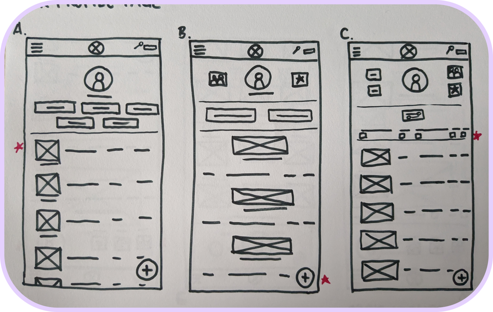
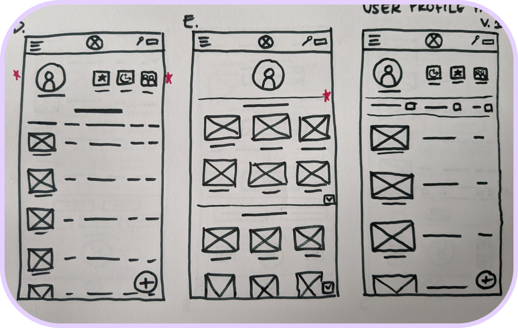
This was my first time making paper wireframes. It was a lot of fun! I tried to come up with a wide range of variations and really explore layouts beyond my initial ideas.
Low Fidelity Prototype
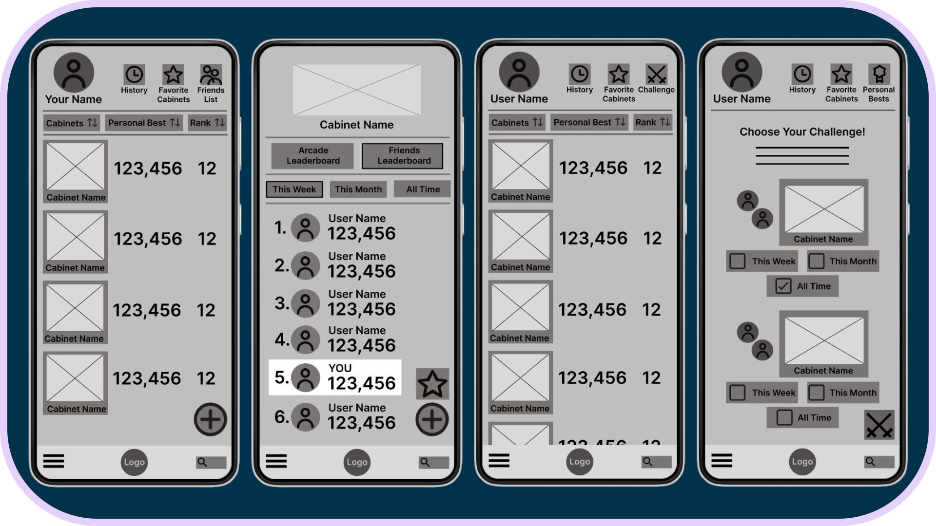
I connected each screen for the main user flow which leads players from their profile to the game leaderboards, then to a friend’s profile and on to sending a challenge. They can also navigate through the Friends List.
User Testing Results
Differentiating between certain elements (like friends versus regular users and friends versus general leaderboard) and knowing which elements were clickable were the biggest issues people had with the app. Some people weren't familiar with the term "cabinet," so there was some additional confusion there.
I wanted to make a layout with easy-to-read text and clearly-defined buttons while including all the features players need. The limitation of grayscale was definitely a challenge! It was also my first time with Figma.
Digital Wireframes
Iterations
With the usability study in mind, I replaced the word "cabinet" with "game" which is a much more widely-known term, increased the negative space, and decluttered the Challenge Page. With some greatly-appreciated peer feedback, I was able to rework the category tabs to look much more tab-like and easy to differentiate.
Polished Designs
High Fidelity Prototype
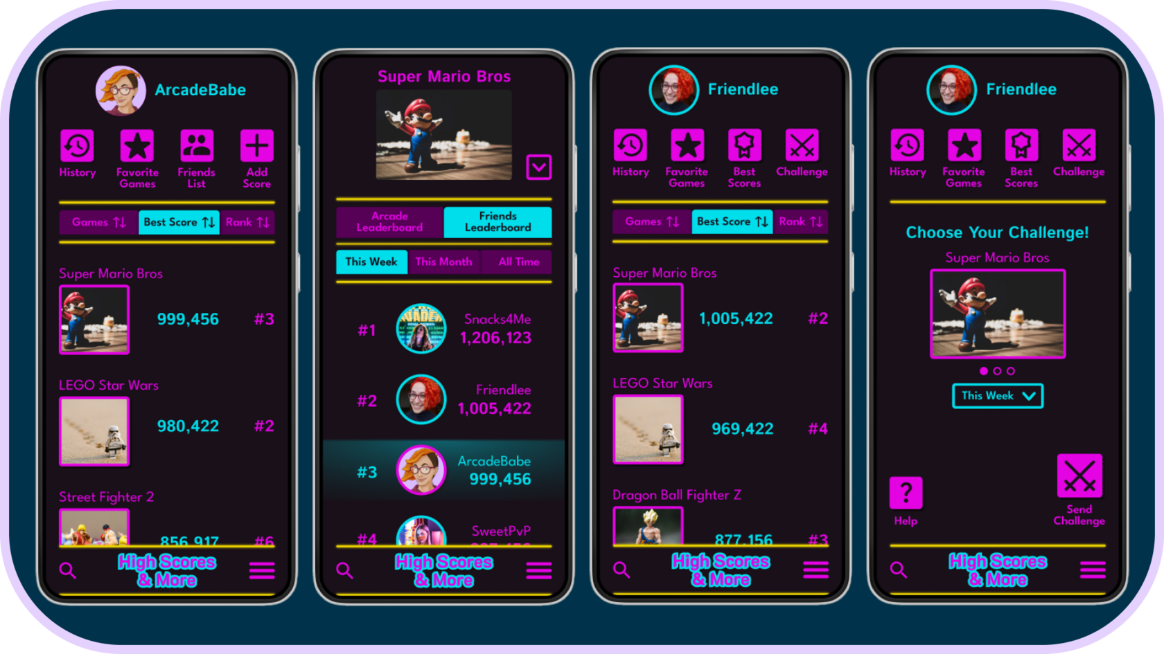
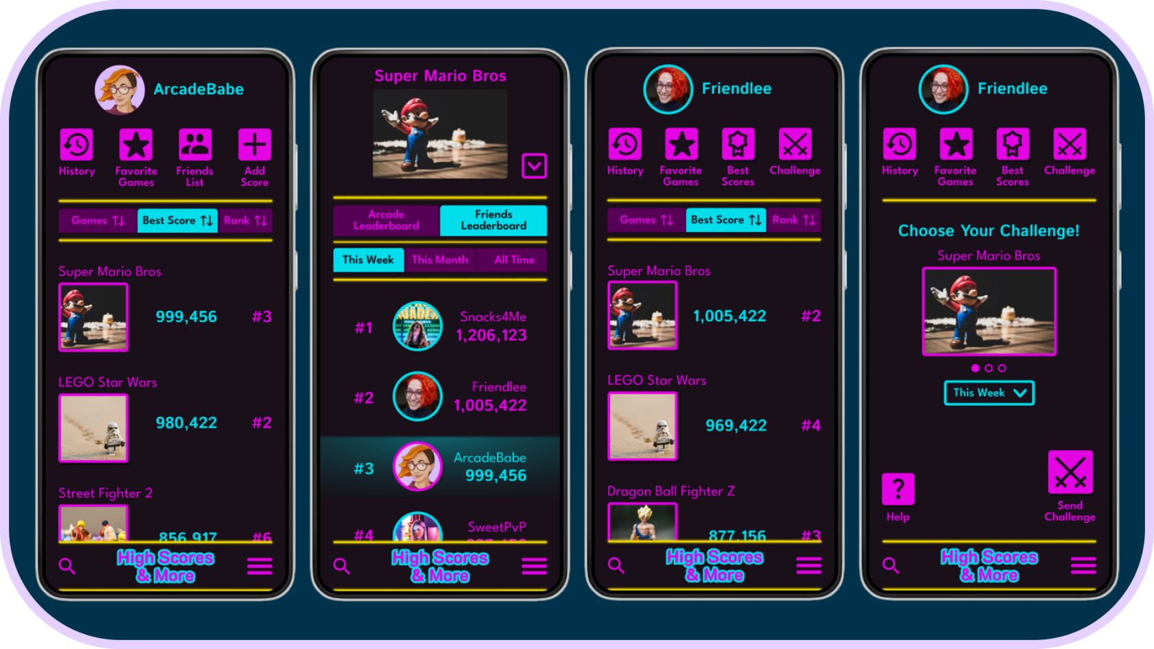
The flow is the same as the low fidelity version, but it looks much more like you're looking through your local arcade.
Conclusion
“Dope. That was easy enough.” - Sol
“Nice filter options here.” - Travis
People were enthusiastic about the number of options present in the prototype and how easy the app is to use.
I learned that usability studies are invaluable because I often need more emphasis than I anticipate and users help highlight which elements need more clarity.
The next steps I would take are to add statistics so that players' scores have additional meaning and grounding, giving them additional interest. I would add a “versus” page to let people directly compare their scores side by side and add friend groups so that multiple players can easily compare with each other regardless of individual friends lists.
“Nice filter options here.” - Travis
People were enthusiastic about the number of options present in the prototype and how easy the app is to use.
I learned that usability studies are invaluable because I often need more emphasis than I anticipate and users help highlight which elements need more clarity.
The next steps I would take are to add statistics so that players' scores have additional meaning and grounding, giving them additional interest. I would add a “versus” page to let people directly compare their scores side by side and add friend groups so that multiple players can easily compare with each other regardless of individual friends lists.
The colors were inspired by the neon lights in a classic arcade. I used both color and elevation to increase the emphasis and make the tabs and buttons pop even more.
Mockups
Curiosity about life in all its aspects, I think, is still the secret of great creative people.
Introduction
Introduction
Introduction
Introduction
