Bespokely
Case Study
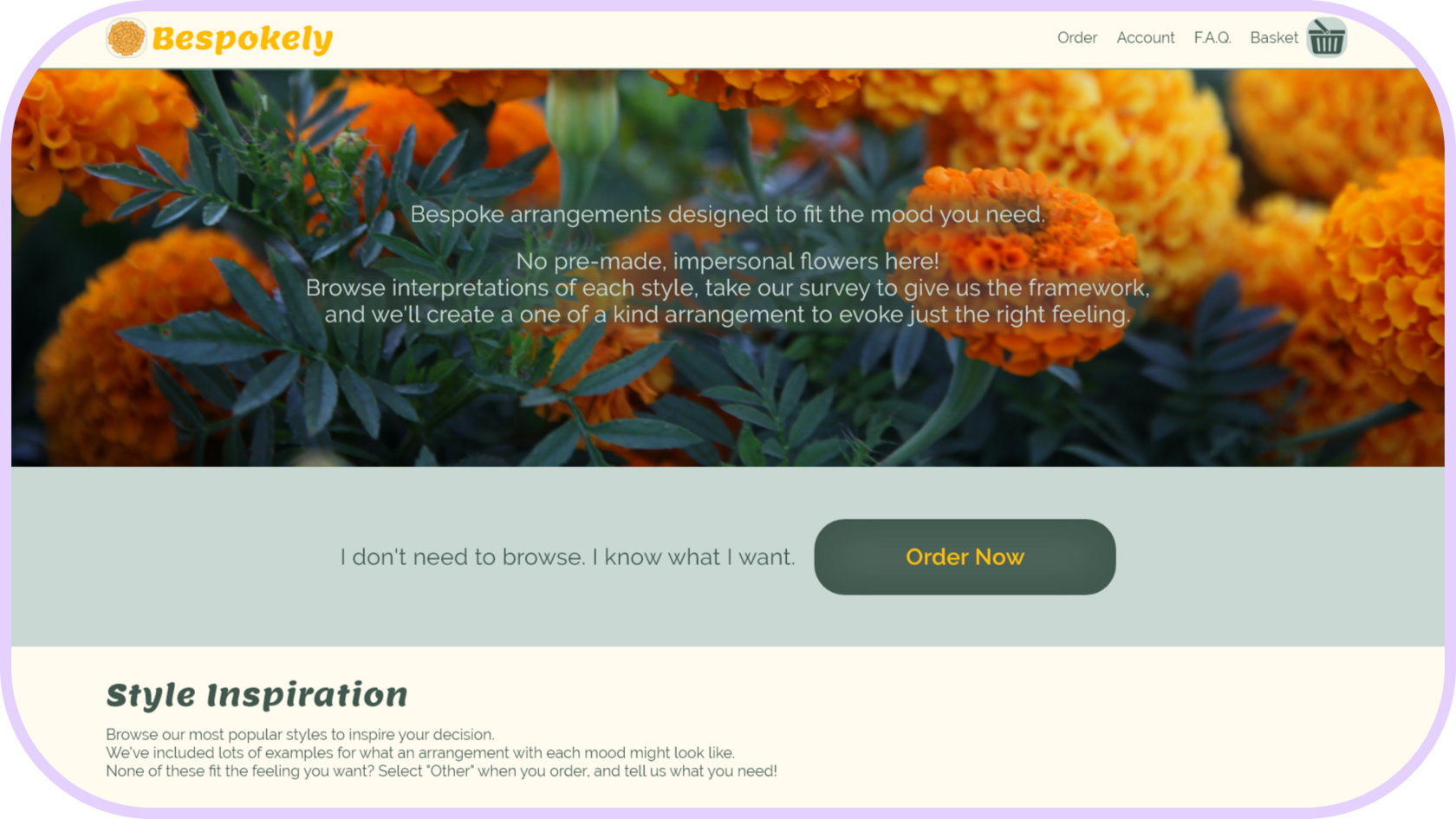
As the sole UX Designer and Researcher in this project, I researched users and competitors, created a low fidelity prototype, ran a usability test and got peer feedback, and designed a high fidelity prototype with the polished designs. You can find out the details and my process in the sections below.
Overview
Introduction
The User
Initial Concepts
Polished Designs
- My Role
- My Goal
- Target Audience
- The Problem
The User
- Foundational Research
- Persona
- User Journey
Initial Concepts
- Sitemap
- Paper Wireframes
- Digital Wireframes
- Low Fidelity Prototype
- User Testing Results
- Iterations
Polished Designs
- Mockups
- High Fidelity Prototype
- Conclusion
Table of Contents
My Role
Solo UX Designer & Researcher
Introduction
My Goal
Remove the stress from the flower ordering process and create a quick and fun experience.
Target Audience
Anyone who likes flowers and might order them sometime. :)
The Problem
People want customized floral arrangements, and they spend too long looking only to end up compromising on an arrangement they worry won’t match the photo.
The User
By interviewing a few people, I discovered:
1. Pre-made arrangements are boring and not customizable, so the design should allow people to specify their needs to the designers.
2. People are overwhelmed by loads of categories and endless pages of arrangements and are confused by size options, so the design should limit options to the essentials.
3. Small text, crowded headers, and too much text is frustrating and inaccessible, so the design should focus on accessibility and simplicity.
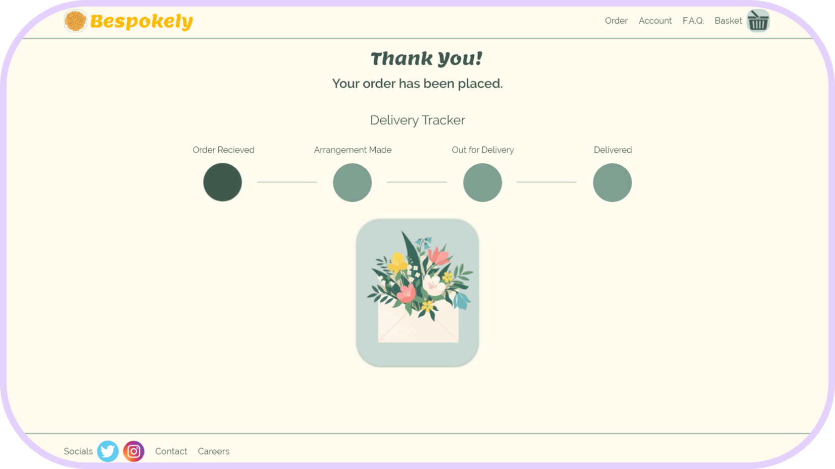
4. Lack of delivery tracking or notice of delivery is stressful, so the design should include communication on delivery status.
1. Pre-made arrangements are boring and not customizable, so the design should allow people to specify their needs to the designers.
2. People are overwhelmed by loads of categories and endless pages of arrangements and are confused by size options, so the design should limit options to the essentials.
3. Small text, crowded headers, and too much text is frustrating and inaccessible, so the design should focus on accessibility and simplicity.
4. Lack of delivery tracking or notice of delivery is stressful, so the design should include communication on delivery status.
Foundational Research
I mapped how Cheryl might order flowers with the current offerings on the market. Cheryl's goal is to send flower arrangements that are as unique as the recipient.
User Journey
Cheryl
Goals
Frustrations
Platform

Tasks: Open browser, Google shops in recipient's location, open websites in new tabs.
Feeling: Focused and excited to send a gift.
Feeling: Focused and excited to send a gift.
Step 1 - Search for local flower shops
Tasks: Pick a site, choose a category, scroll arrangements, open contenders in new tab, repeat.
Feeling: Curious to see what's available, skeptical that the choices will be unique, slightly overwhelmed by lots of categories.
Feeling: Curious to see what's available, skeptical that the choices will be unique, slightly overwhelmed by lots of categories.
Step 2 - Browse arrangements
Tasks: Select size/price, look for customization options, search for comments box.
Feeling: Frustrated by lack of options and lack of photos for different sizes, annoyed at long paragraphs and small text, worried lilies will be included which are bad for cats.
Feeling: Frustrated by lack of options and lack of photos for different sizes, annoyed at long paragraphs and small text, worried lilies will be included which are bad for cats.
Step 3 - Customize arrangement
Tasks: Checkout, receive order confirmation, wait for delivery time, hope recipient reaches out when they get the delivery.
Feeling: Worried delivery won't arrive, nervous something will go wrong.
Feeling: Worried delivery won't arrive, nervous something will go wrong.
Step 4 - Place order & wait for delivery
Meet Cheryl! Cheryl is a busy graphic designer who needs a quick and easy way to order unique flowers for her family because she wants shopping to be as enjoyable as giving.
Persona
Time zone differences and work obligations make calling a shop difficult. Plus, shop websites are often outdated. She worries that the flowers that are delivered won’t look like the photos or that they won’t arrive at all.
Cheryl has a full schedule as a graphic designer, and her bubbly personality keeps her social calendar full too. She lives far from family and wants to send bespoke arrangements suited to each person as gifts.
Cheryl is a tech-savvy woman who is most likely to access the site on desktop and would open multiple tabs to compare websites and arrangements.
1. Websites use small text and use outdated systems.
2. No tracker or delivery confirmation.
3. Premade designs feel impersonal.
2. No tracker or delivery confirmation.
3. Premade designs feel impersonal.
1. Send stylish flower arrangements to her family.
2. Complete an order on her lunch break.
3. Remind her loved ones that they’re cared for.
2. Complete an order on her lunch break.
3. Remind her loved ones that they’re cared for.
Initial Design Concepts
Because people were overwhelmed by a deluge of choices, I intended to keep the number of categories and pages to a minimum. A hybrid of hierarchical and sequential information architecture seemed like the simplest layout to follow.
Sitemap
Paper Wireframes
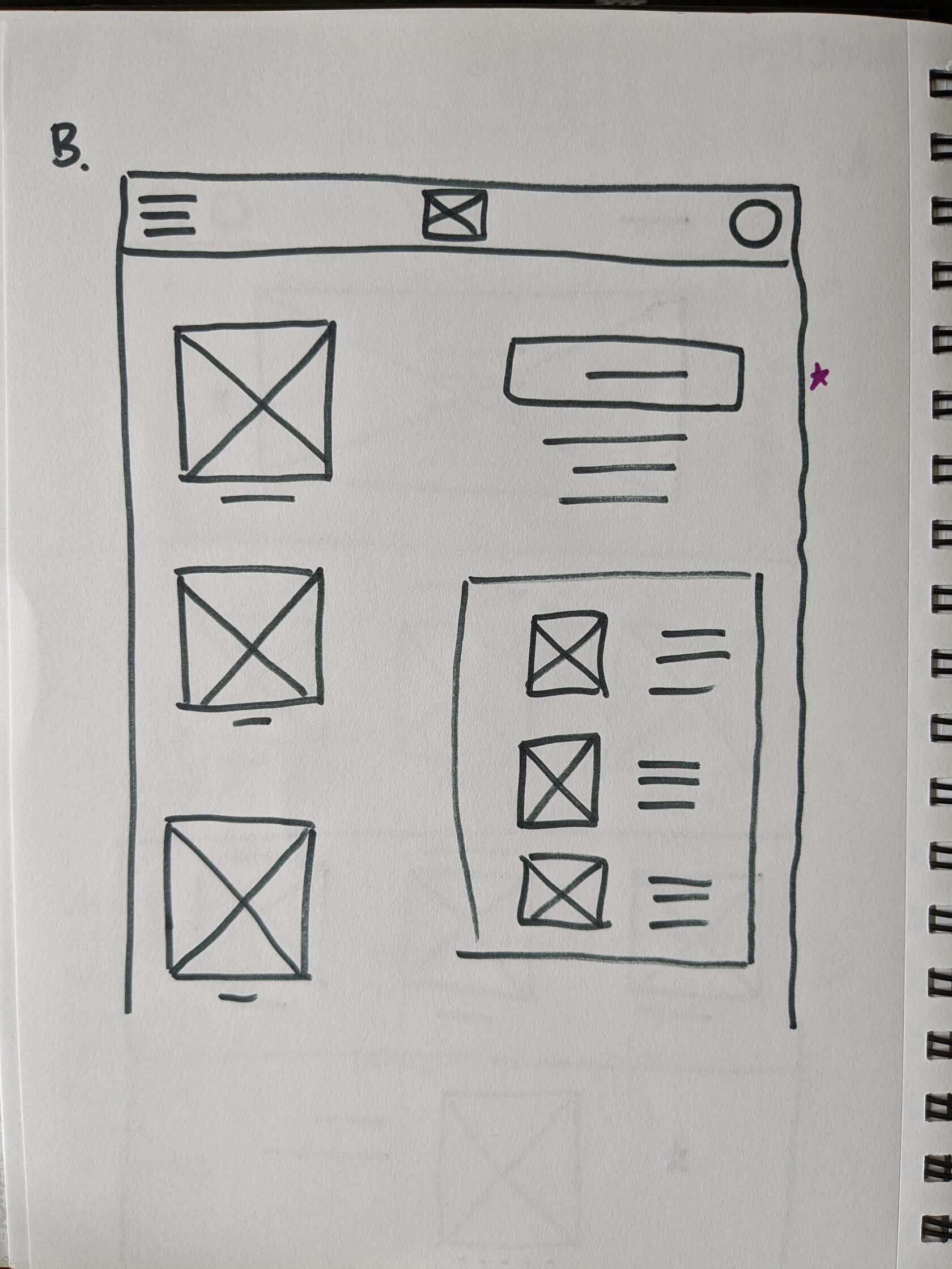
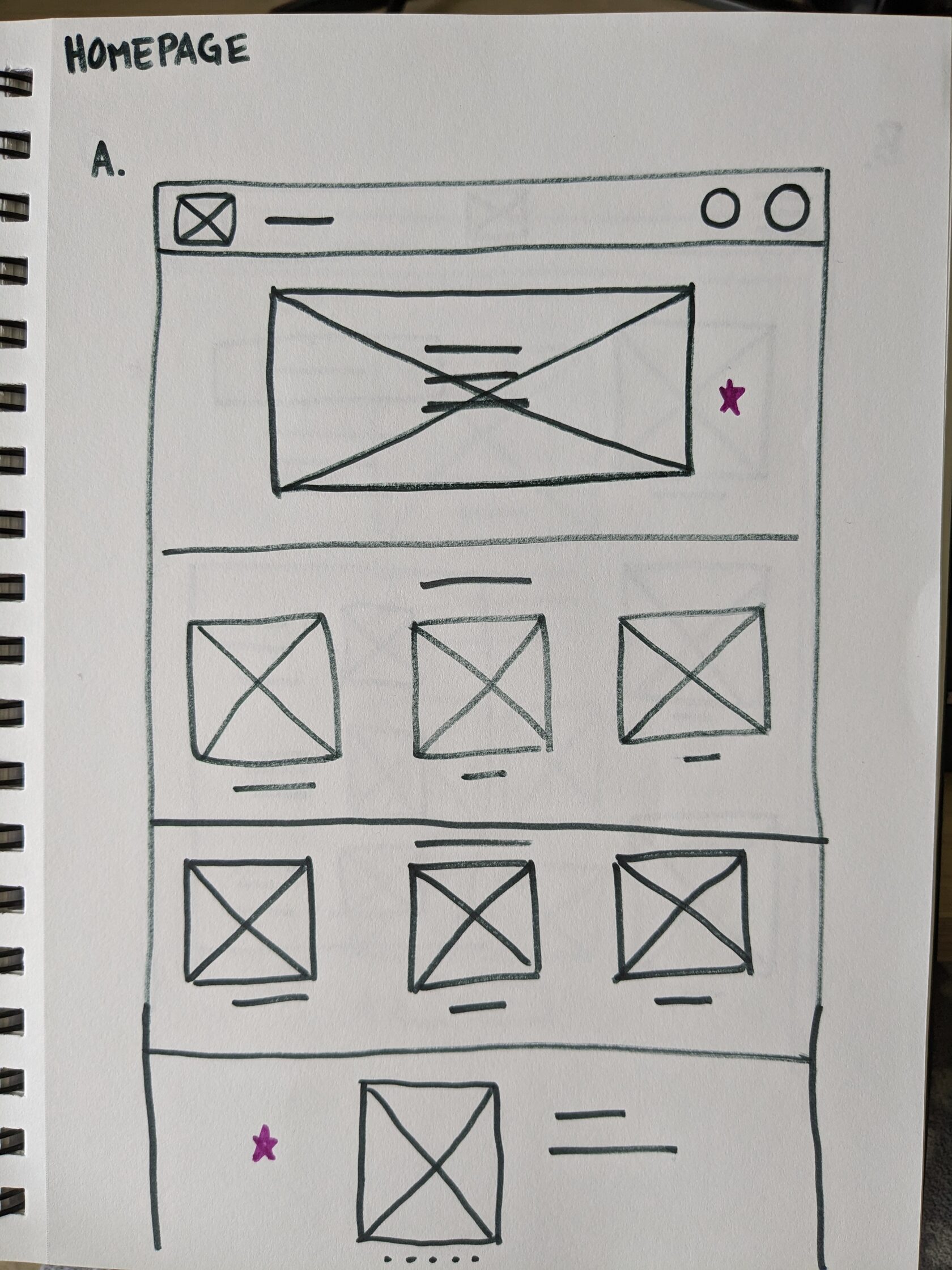
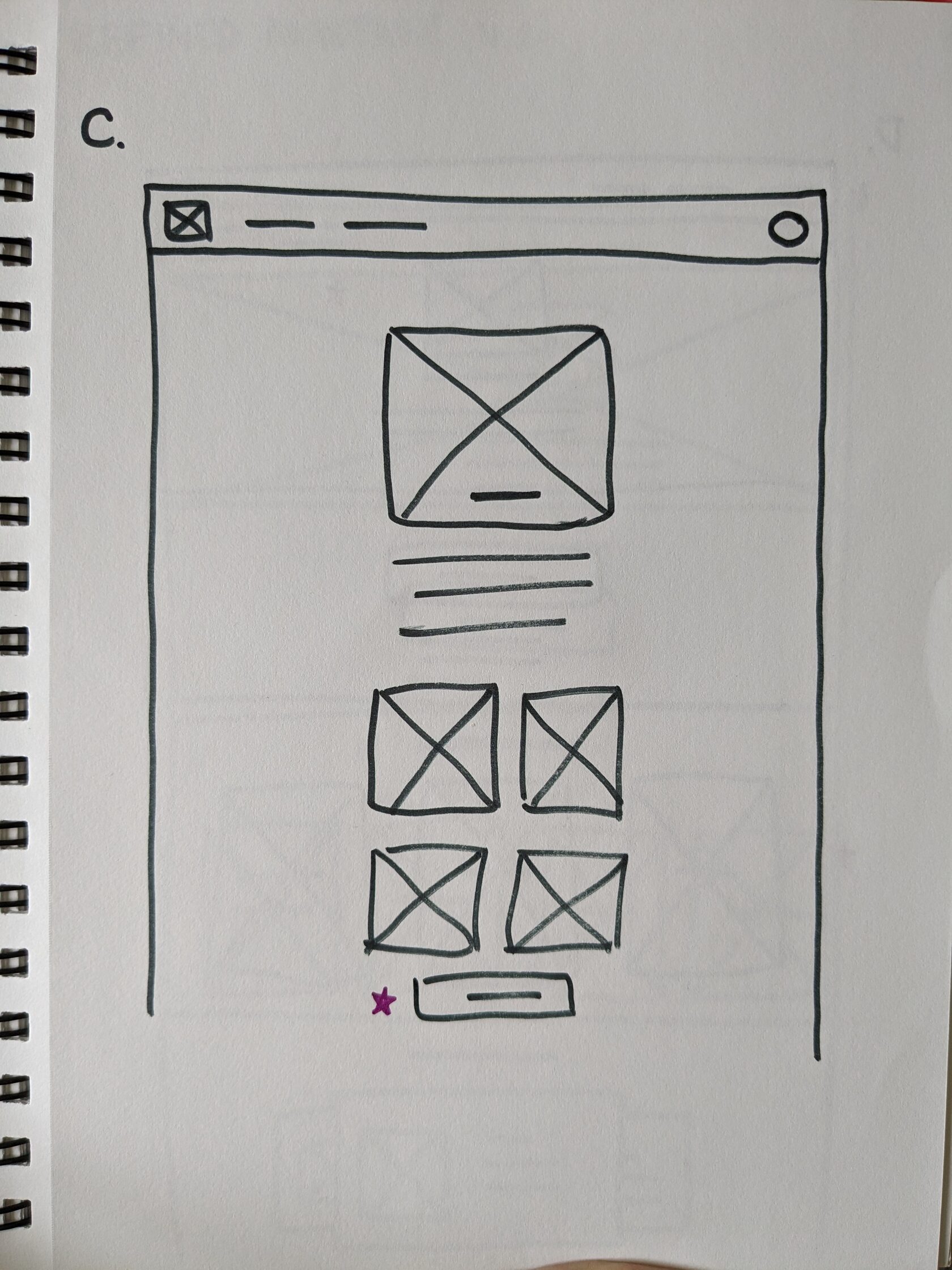
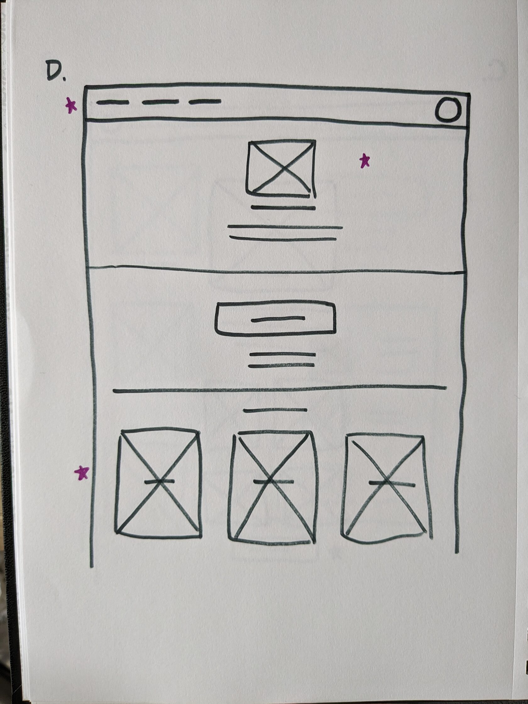
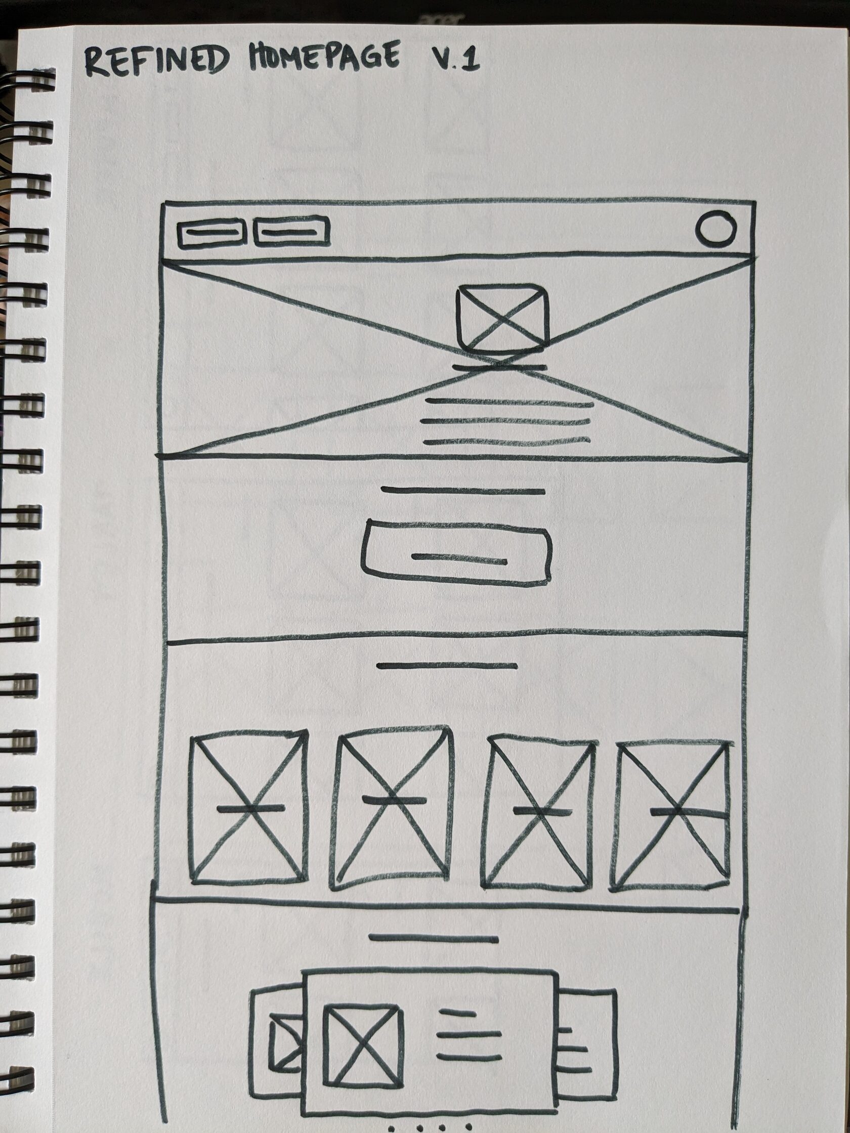
I sketched various ideas for the layout of each page. I used large buttons and text, and avoided expanding menus throughout iterations.
Low Fidelity Prototype
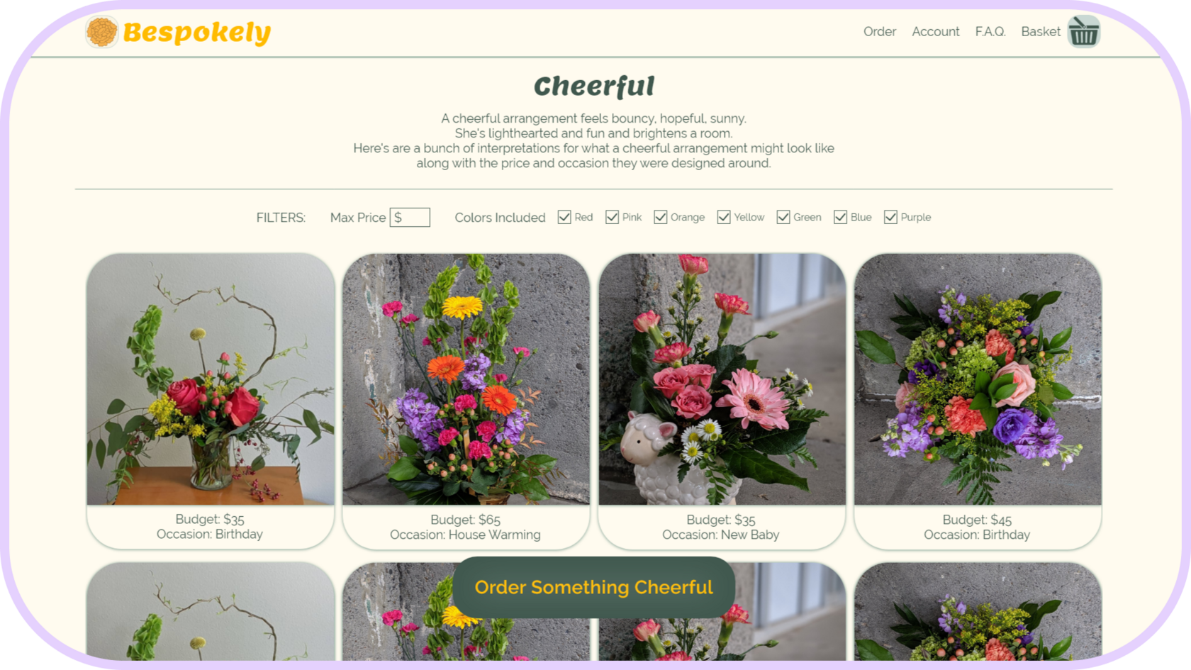
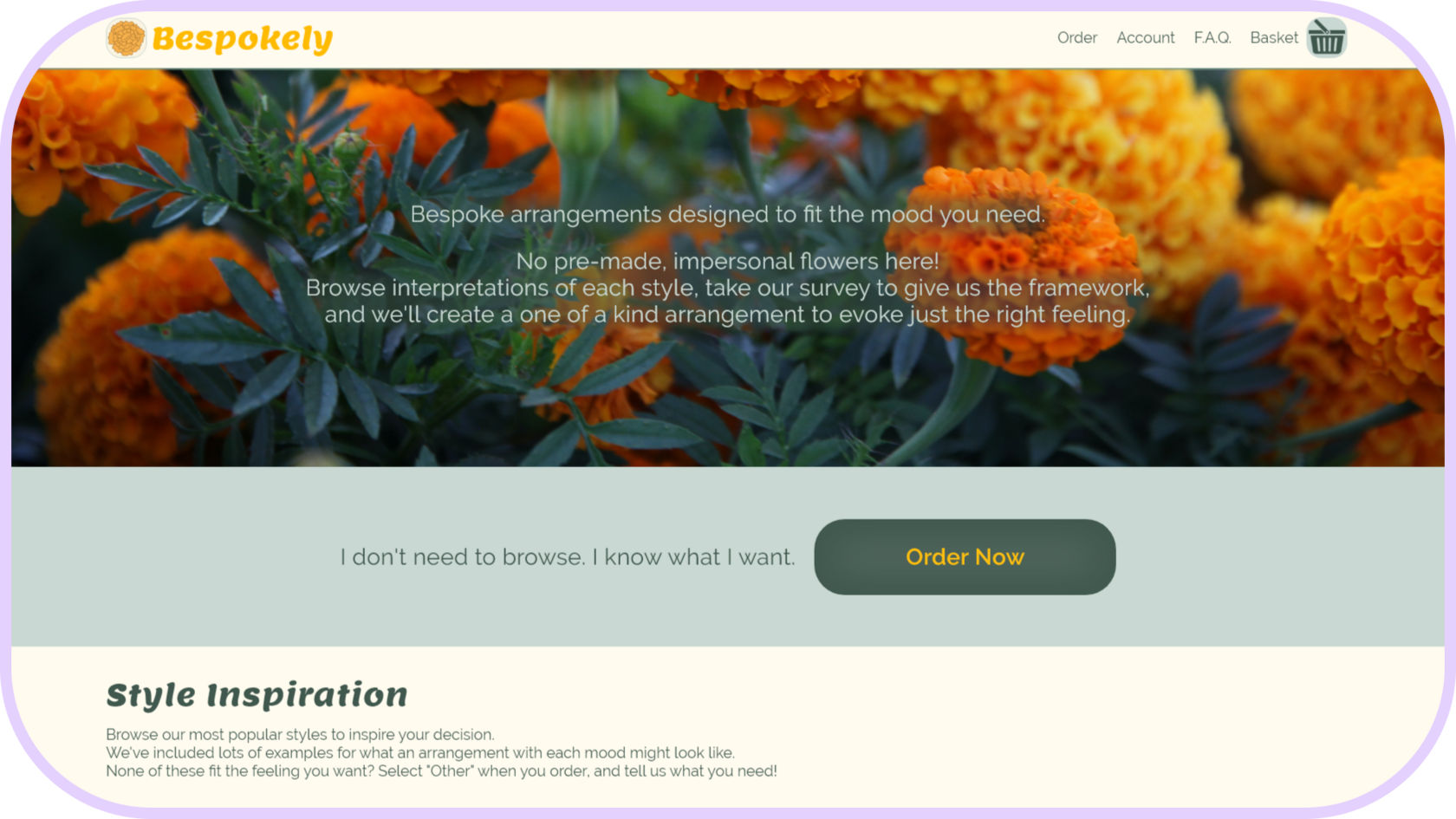
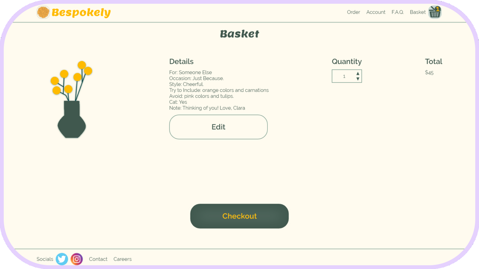
I connected each screen for the main user flow which includes browsing styles of arrangements, taking a survey to generate information the florists will need to design the arrangement, adding those results to the basket, and checking out.
User Testing Results
I planned and conducted an unmoderated usability study. The results surprised me! Only 2 out of 5 people chose the same entry point to begin ordering. They enjoyed the process and found it clear and easy no matter their entry point. It received a lot of compliments and pretty much no criticism, though one user did catch a screen I forgot to add. Whoops!
Flower Styles
Account
Style One
Style Three
Question Two
Question Three
Question Four
Change Password
Saved Payments
Past Orders
Delivery
Billing
Delivery Tracker
Iterations
The only point of confusion uncovered in the usability study was that people assumed “Recent Orders” were theirs instead of other customers. With that in mind, I consolidated the "Recent Orders" section and the "Style Inspiration" page into one concept. I took the peer feedback I received on the layout and features and iterated a couple more times to get a polished design.
Confirmation
Question One
Design Quiz
Basket
Homepage
Style Two
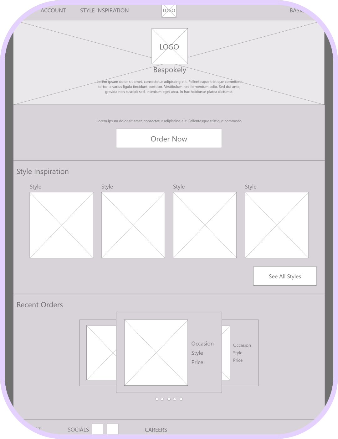
With the refined paper wireframes in hand, I designed low fidelity wireframes in Adobe XD. The uncluttered header and simple navigation keep the cognitive load low. I also limited the number of categories to help prevent people from feeling overwhelmed by too many options.
Digital Wireframes
Polished Designs
Mockups
Then I added modern typography and soft, earthy greens with a pop of mustard yellow to the color palette while keeping within AA accessibility standards for contrast and readability.
High Fidelity Prototype
The flow is the same as the low fidelity version, but I added in the missing screen.
Conclusion
“I love that I feel listened to and that it feels personal because flowers should feel personal. I would definitely use this site.” - Alanna
I learned how important it is to check your work when your mind is fresh so as not to miss obvious mistakes.
The next steps I would take are to add navigation order annotations, accessibility labels, and alt text for greater accessibility.
I learned how important it is to check your work when your mind is fresh so as not to miss obvious mistakes.
The next steps I would take are to add navigation order annotations, accessibility labels, and alt text for greater accessibility.
Curiosity about life in all its aspects, I think, is still the secret of great creative people.
Introduction
Introduction
Introduction
Introduction
